Arjun Maini Is Haas F1 Team's New Development Driver
- May 12, 2017
- Views : 1770


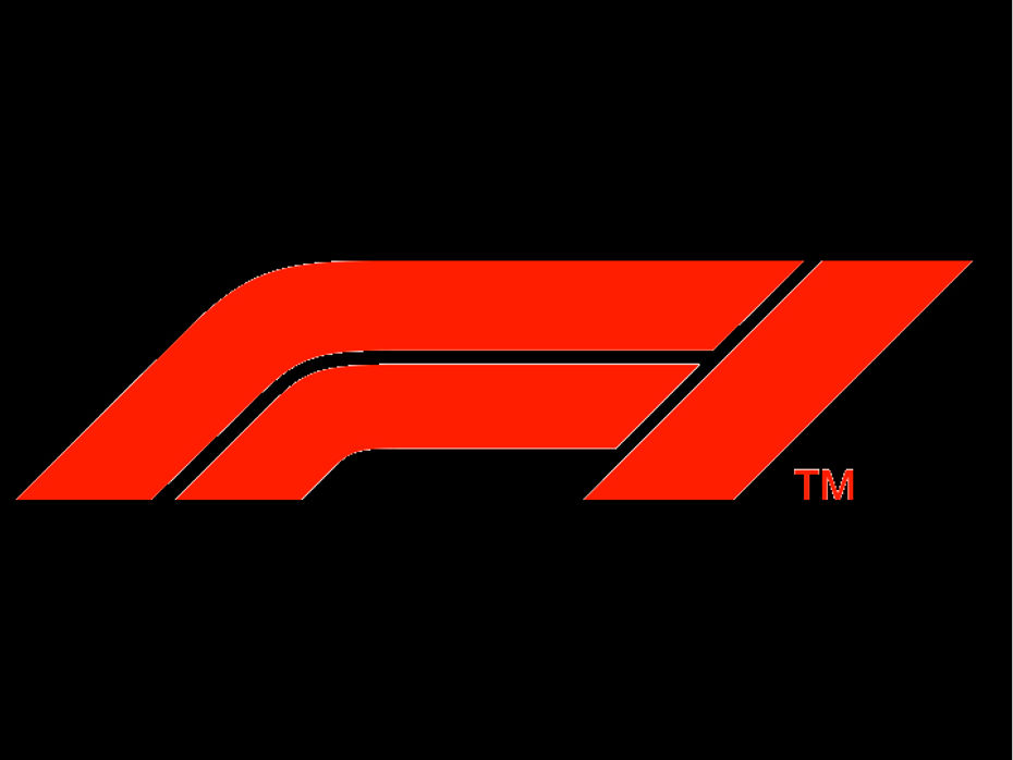
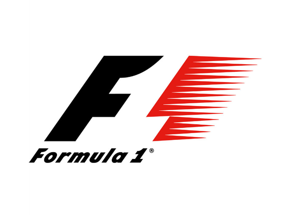
Formula 1 is easily one of the most prestigious and glamourous championships in the world irrespective of sport. It is not only the pinnacle of automotive engineering but an instantly recognisable brand as well. We’d go so far as to say that even people who have no interest in motorsports know or have at least heard of it at some point. They might not like it but they have definitely heard of it. That is the clout the brand commands. And, as with any big brand, one of the biggest part of its image and personality is its logo. Called the ‘flying one’, the older logo was instantly recognisable and comprised of a large ‘F’ and a ‘1’ formed by the empty space next to it. Last Sunday, however, Formula 1 unveiled its new logo at the end of a rather uneventful Abu Dhabi GP. By doing so, the owners of Formula One, Liberty Media, have managed to receive some severe backlash from drivers and fans alike.

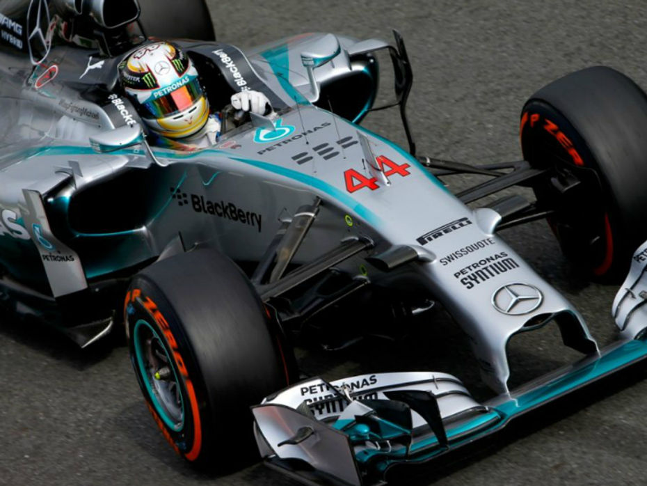
Lewis Hamilton, the four-time and current World Champion, expressed his dismay about the recent change at the post-race interview stating that the old logo was “iconic, but the new one isn’t. Imagine if Ferrari changed theirs.” Similar sentiments were also echoed by team-mate Valtteri Bottas and Ferrari driver Sebastian Vettel. Going by the sheer number of tweets from fans across the world, it seems they aren’t too happy either.

Formula 1 chief Chase Carey has defended the move by saying, “What we wanted to do was provide a fresh energy to the sport and I think we have a lot of plans for the future, a lot of things we want to do and we thought the logo was a good way to emphasise the excitement, fresh energy and a new day to take the sport to a new place.”
"That's respecting what the sport has been. We're not looking to change the sport, we're looking to provide a fresh innovation and energy to a great sport that we can enhance in a number of ways.” FIA president Jean Todt came to Carey’s rescue by stating that the new logo, which will be in place from the 2018 season, is an evolution of the existing logo and that the move should be encouraged if it is in line with developing interest among both manufacturers and fans in F1.
True Formula 1 fans would know that prior to 1993, there wasn’t an F1 logo per se. Ever since the current one was introduced, it has garnered an iconic status. Yes, many manufacturers change their logos over the years, be it Ferrari, Mercedes or even Ford. But once the logo attains an iconic status, they are best left alone. In the case of Ferrari, the prancing horse has been around since 1947. The same goes for the Mercedes-Benz’s three-pointed star (1916) and Ford’s blue oval (1927).

In our humble opinion, in this particular case, the core design of the logo has undergone a drastic change. It feels more akin to a redesign than an evolution. Logos are something all motorsports fans instantly connected with. Watching every race weekend for the past 23 years, the current logo has become a part of is. It was part of the whole race weekend experience. It has become as much of an icon as any legendary driver on the grid. You can’t separate the sport from the logo. However, with the new one, it might not be the case anymore. Yes, the logo might gain traction over time and become synonymous with the iconic sport again. But our only question is this: If it ain’t broke, why fix it?

Arjun Maini Is Haas F1 Team's New Development Driver

Porsche Too Quits WEC; Is Formula E The Future?

Mahindra Racing Formula E Team Announces New Partnerships

Audi Unveils Its First Electric Racecar

Renault Extends Standard Warranty On Kwid, Triber, And Kiger To 3...

Is The Kia Syros More Compelling Than The Best-selling Hyundai Creta?

Auto Expo 2025 - All You Want To Know About The Hottest Auto Show!

Hyundai Creta Electric REVEALED Ahead Of Auto Expo 2025! Here’s...

Upcoming Maruti Suzuki Cars Expected In 2025: e Vitara, Baleno...

Here Is The List Of All Tata Cars Likely To Be Launched In 2025
India's largest automotive community
 Here Is A List Of SUVs Coming To The Indian Market In 2025
 Check Out The List Of The Top 5 SUVs Showcased At The Auto Expo 2025
 Auto Expo 2025: Toyota Hilux Black Edition Explained In 10 Images
 India’s Most Affordable Car, The Vayve Eva Is Priced From Rs 3.25 Lakh! Here Is A Look At All Of Its Variants!
 Vayve Mobility Eva
Rs. 3.25 Lakh
 BMW X3
Rs. 75.80 Lakh
 Hyundai Creta Electric
Rs. 17.99 Lakh
 Lotus Emira
Rs. 3.22 Crore
 Lotus Emeya
Rs. 2.33 Crore